Art Around OKC
Allied Arts
Overview
This new site would serve as a hub for all arts activity from all notable arts organizations within the Allied Arts network of nonprofit organizations. This included entities both big and small, from art openings and community theater to concerts and touring exhibits.


How We Helped
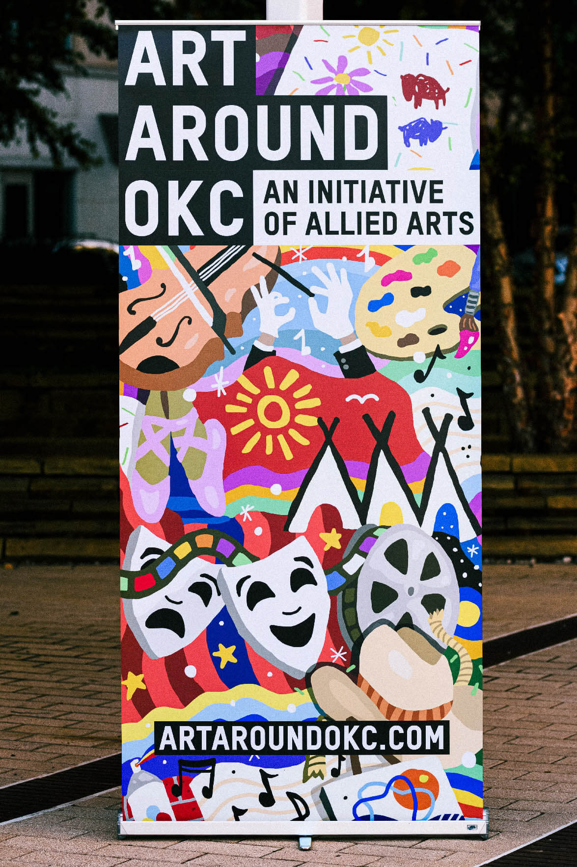
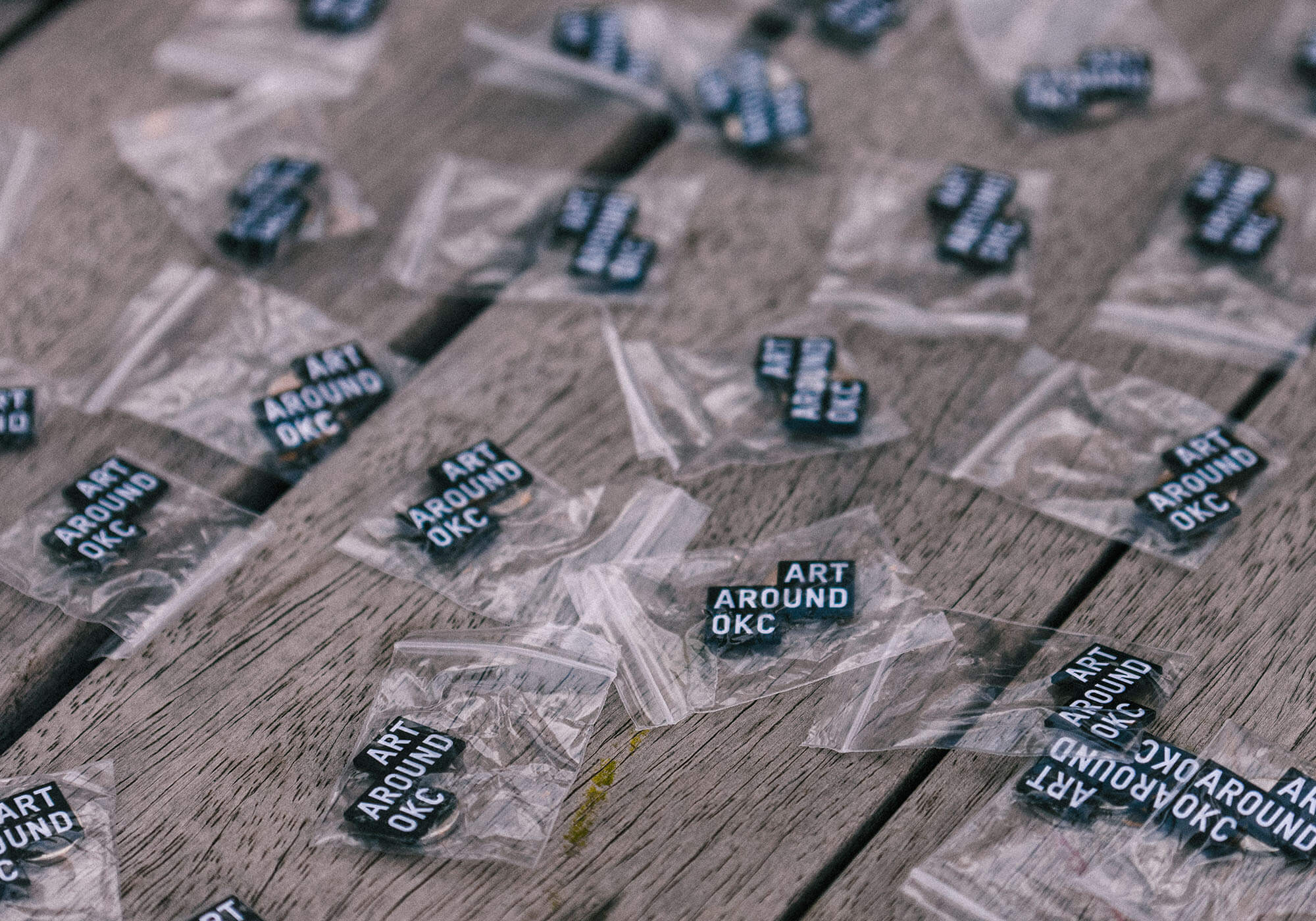
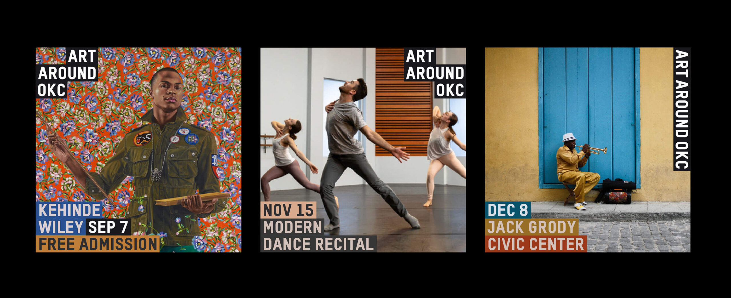
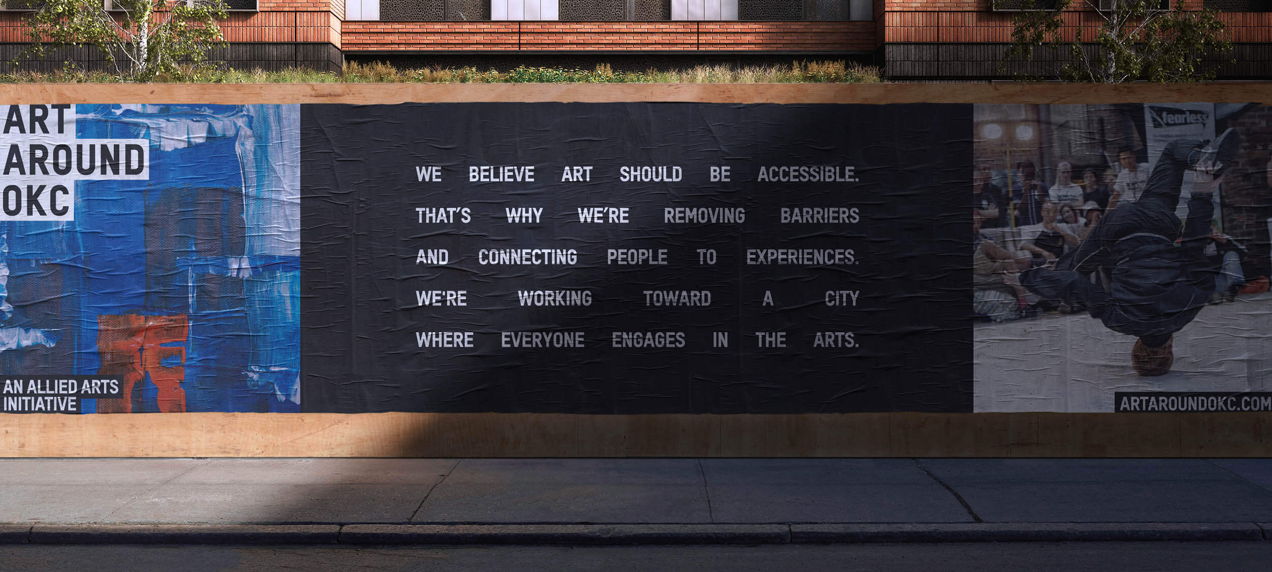
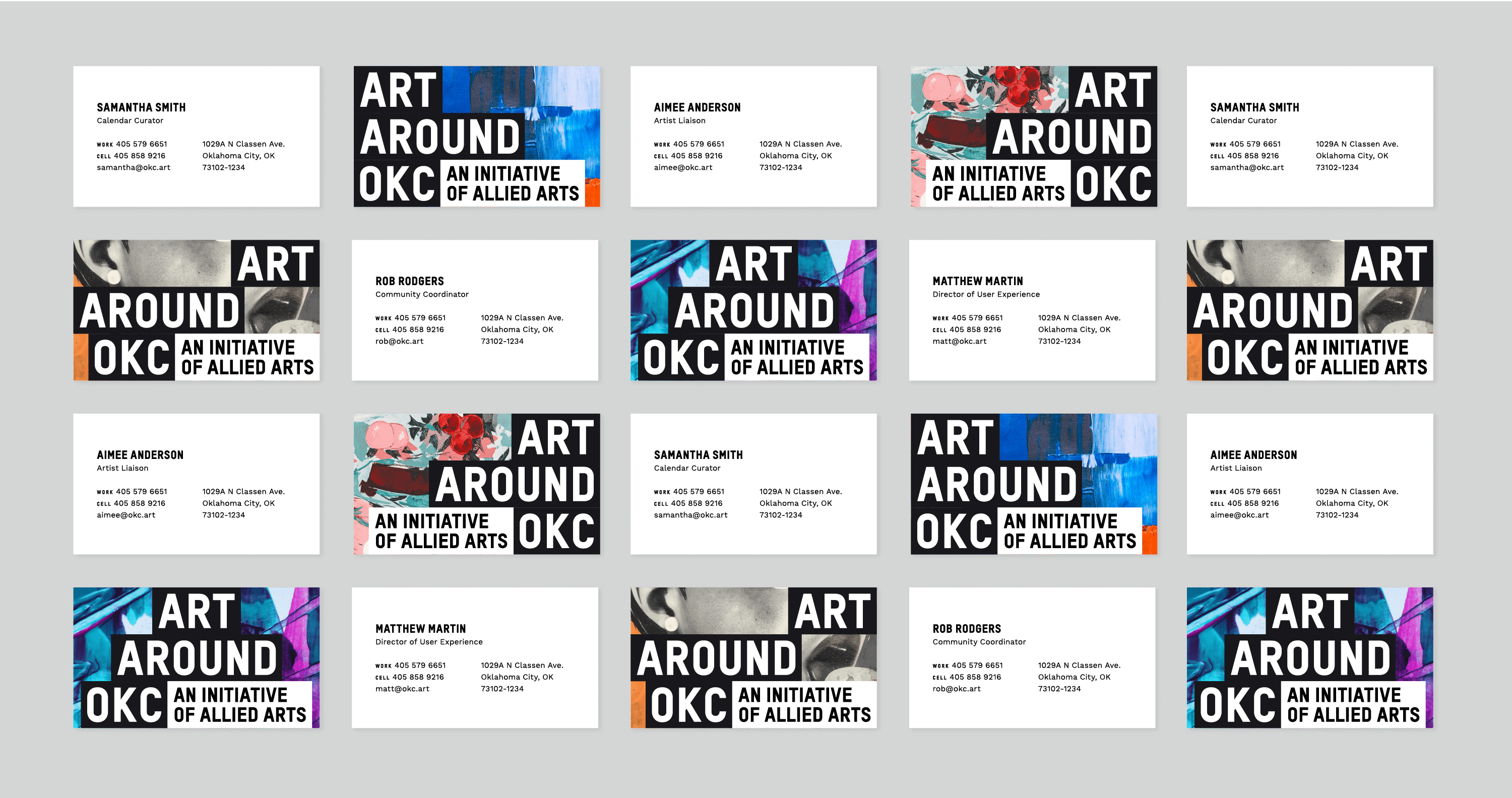
Through our brand strategy process, we recognized that the name itself should be utilitarian, easy to remember and easy to understand – nothing too cute or clever. We adopted Art Around OKC as the simplest solution to those objectives. The mark was developed with consideration that it would almost always be used in conjunction with other nonprofit logos, photography and events, so it was important to us that the mark be strong but not distracting from the elements other organizations would include. The black-and-white mark — which resembles the Oklahoma City metropolitan area on a map — was built not as a single mark, but as the primary mark in a family of logos that can be used to fit any situation, promotional opportunity or platform the occasion required. The visual identity standards allow for colors to be extracted from the nonprofit organization’s photography or logo assets to create complementary blocks of text detailing the events being promoted.
We presented the entire package to roughly 100 stakeholders across the OKC metro area, who were very enthusiastic and complimentary of our efforts to create something original and striking, while still respecting the equity and integrity of their own brands.