405 Center
405 Center
Branding
Marketing
Design
Production
Overview
Justin Coffee had a vision for helping screen, train and connect volunteers with organizations who need real help and don’t have access to qualified assistance. 405 Center worked with more than 42 nonprofits to help get the right people to the right organizations, get them invested and educated on what that organization is about, and get them retained for future, more meaningful volunteer engagement. When 405 Center came to us for help, we aligned on a simple but provocative idea: If we’re really helping everyone in our city, why are we ignoring so many of them?
Live Site
405-center.webflow.io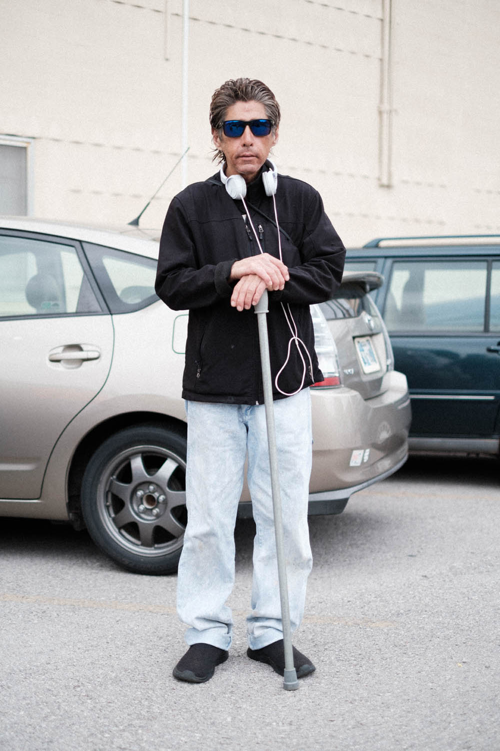

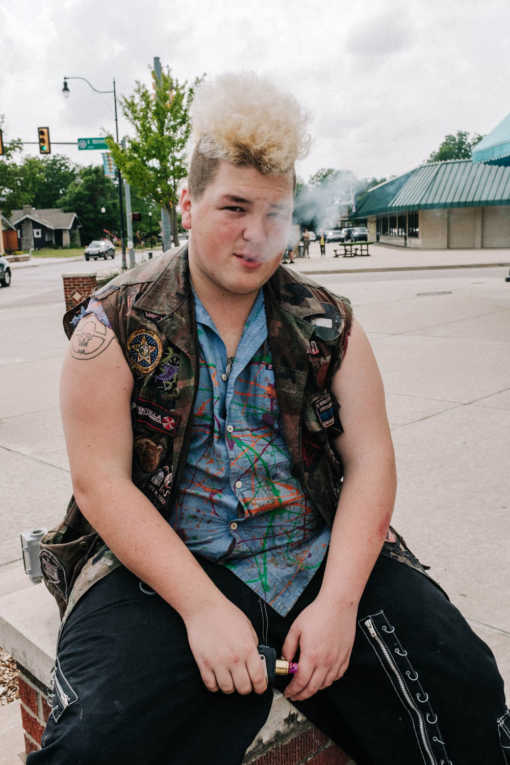


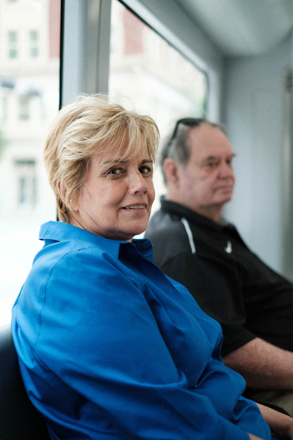
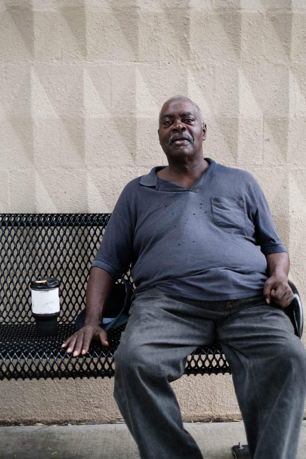


How We Helped
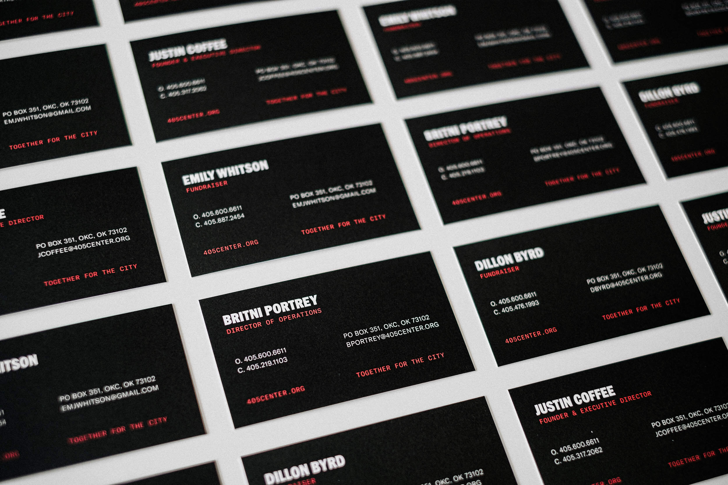
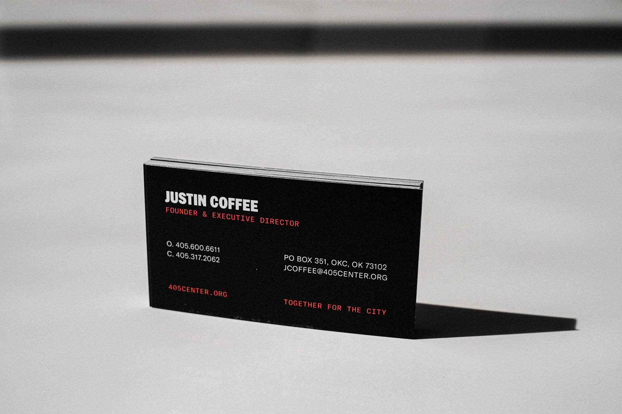
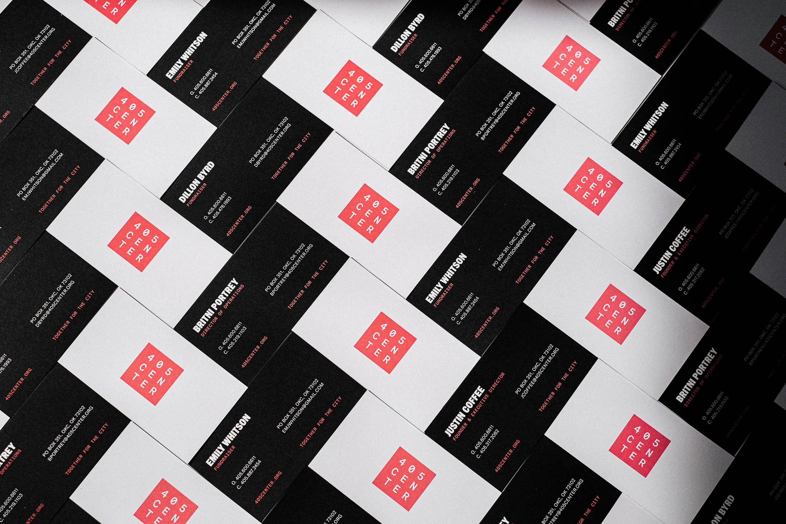
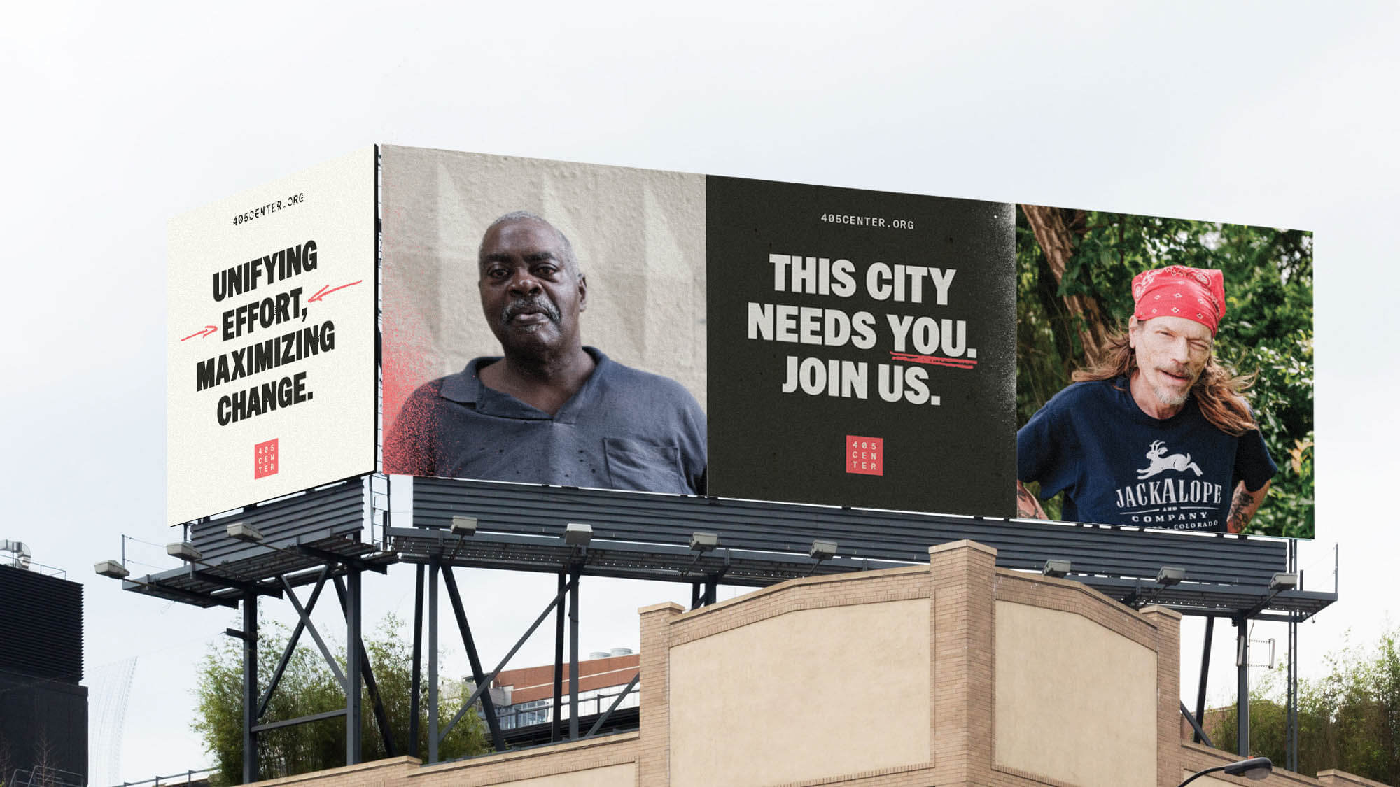
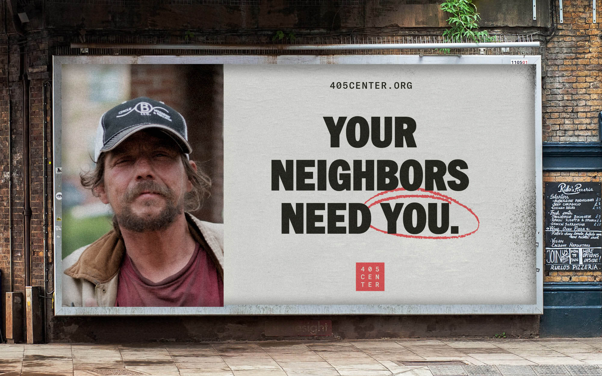
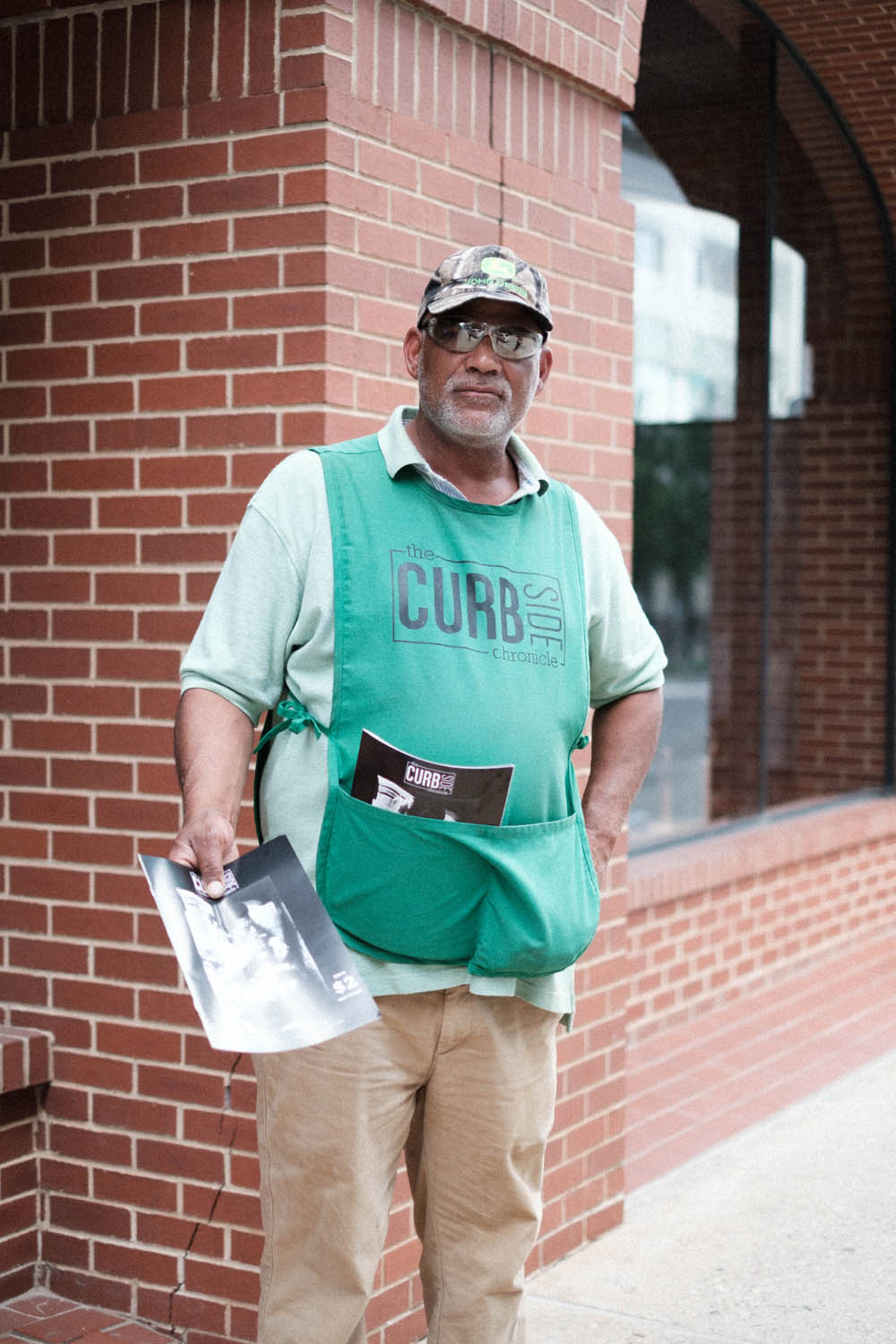
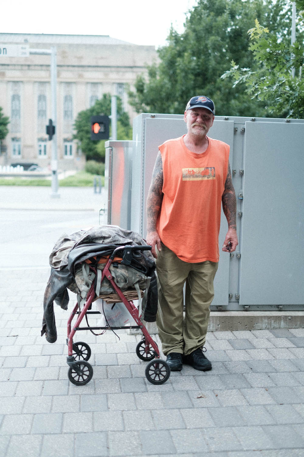
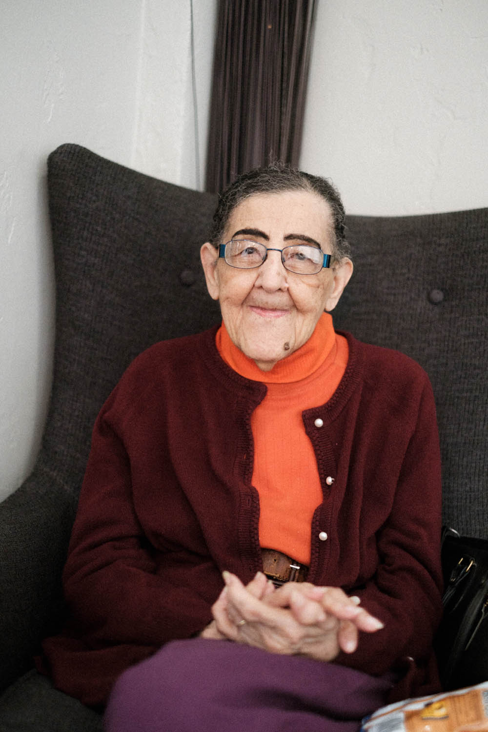
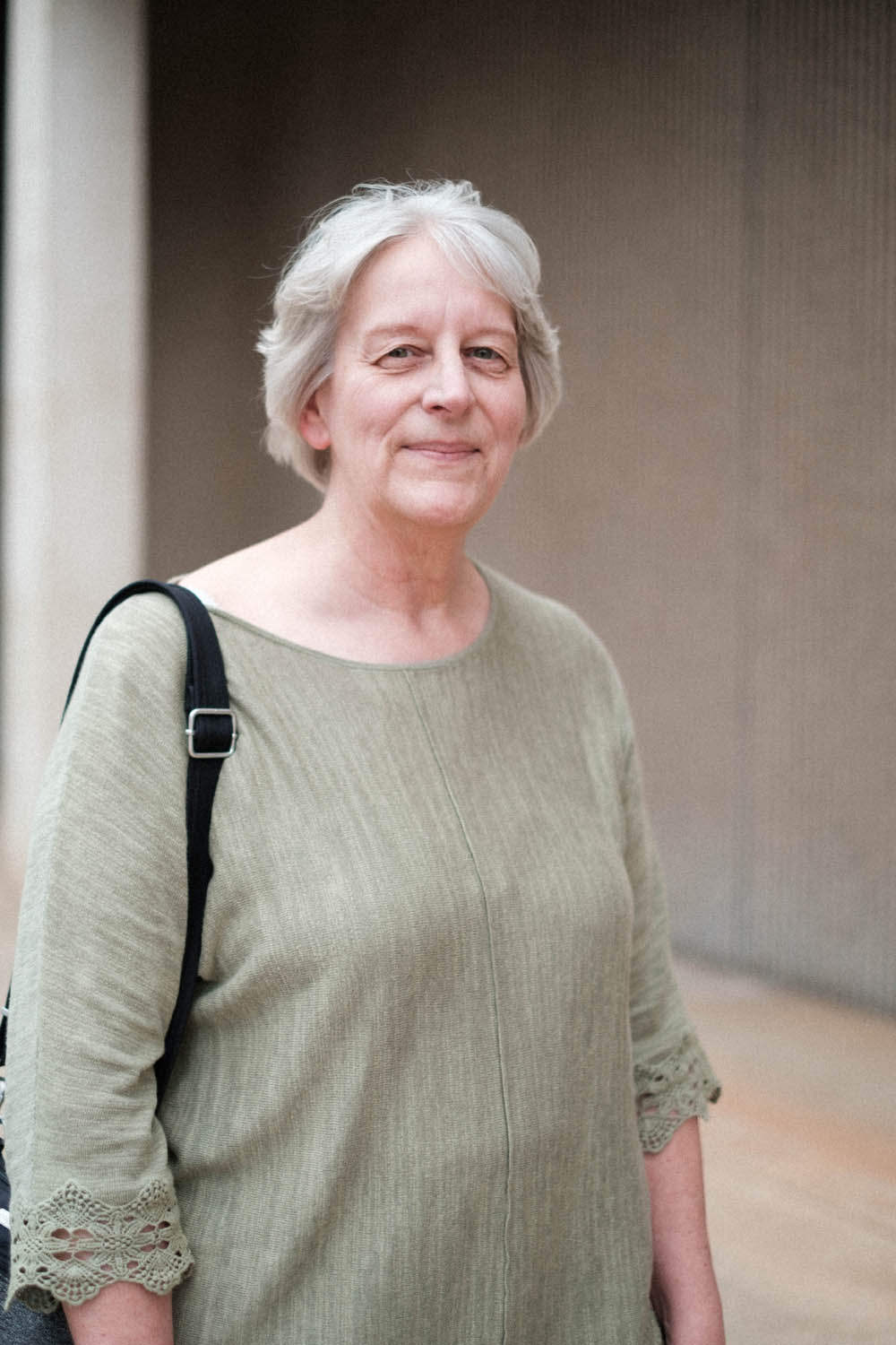
Ghost’s brand exploration process uncovered some incredible insights, takeaways and sticking points, namely that “equality” sounds great until one gets to a group whose priorities might be at odds – or even a challenge to – your own. We found strong and concise messaging to be essential in helping get people’s attention, and elected to use that language on a bold color scheme – just three colors: red, black and white.
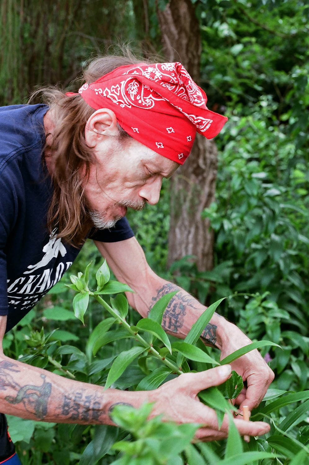
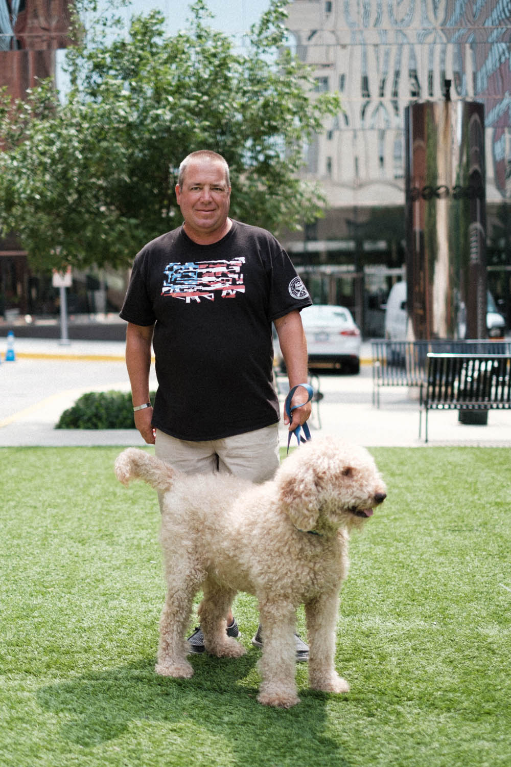
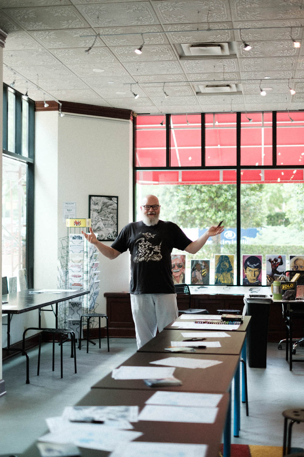
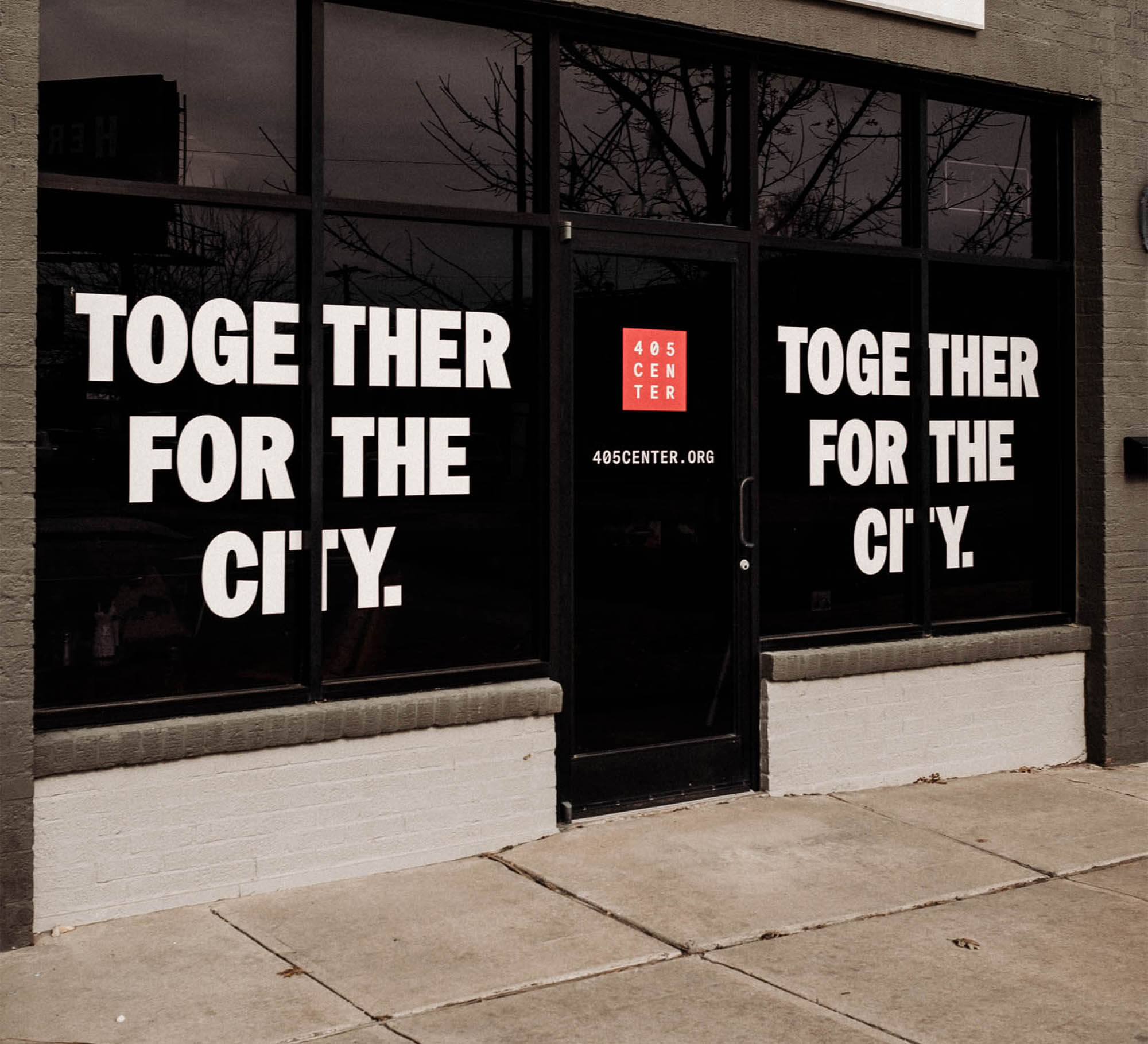
This brand includes custom spray-paint textures, real photography of our neighbors, impactful messaging and standards that help 405 Center spread their brand all over, from website and social media to videos and facility signage.


Team Ghost:
“We wanted to show the real human impact of the 405 Center, so with custom photography and image layering, we shifted the focus from the organization to the people it impacts.”

